CREATIVE PRODUCER

MOTION DESIGNER

ABOUT

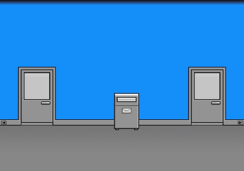
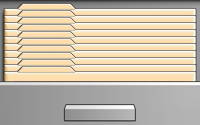
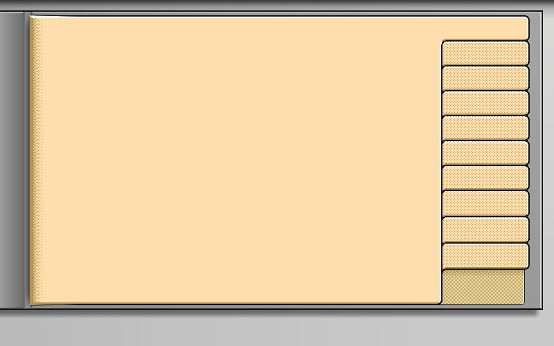
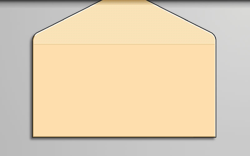
Magic Cap inspired UI

TransOpen was a startup that was working on a new online communication/database software and was looking for a unique UI design. They went through numerous design versions with their firm (Spring Communication), all of which were far too rich for their tastes. They were inspired by Magic Cap, so it had to appear similar, but not too similar, and it all had to look great in only 16 colors. None of these suggestions met their requirements. That's when they found me!

The Job

I was tasked with creating simple pixelated UI graphic elements; after several exploratory stages, Trans Open felt satisfied that we were on the right track and that I could provide all of the screens. During my college years, this is my first professional work as an interaction designer. I worked on these designs during my summer vacation.

My Role

— UI design

1

The Process

1

The Process
Project details
DELIVERABLES

— About 15x pixelated illustrations

TIMINGS

— About 4 weeks, including revisions

TEAM

— Just me


The full set of screens